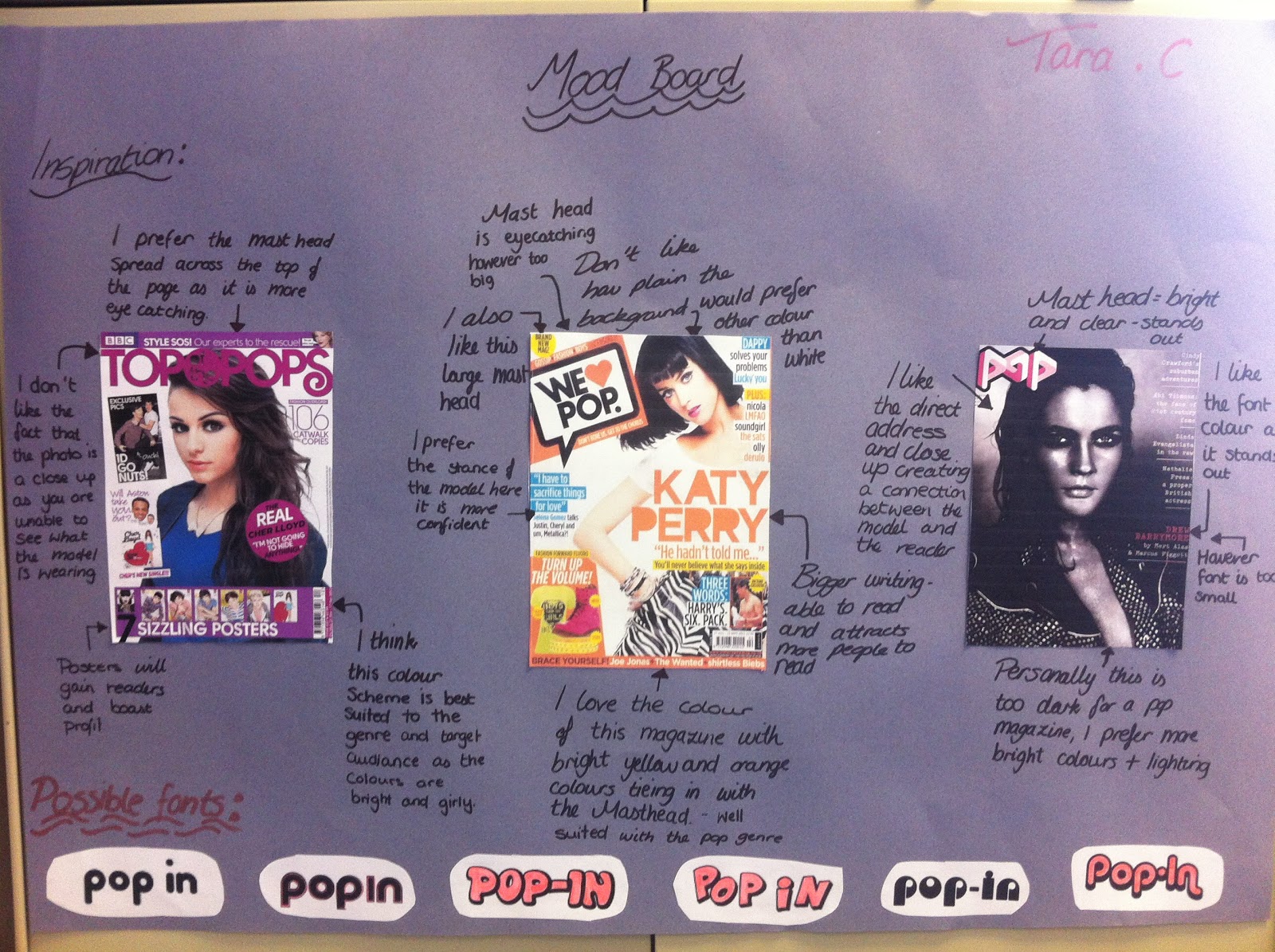
What do you think is the best name for a Pop music magazine?

Tuesday 26 February 2013

Magazine Layout Research

I wanted to prepare for the big job of creating a music magazine therefore I did some research into layouts and conventions and found this video . It was very useful as it helped me see how to create a stereotypical magazine which includes different elements to create an original layout that differs from all the other pop music magazine yet sticks to the typical and expected codes and conventions.

Saturday 23 February 2013

The Treatment


The Magazine: Pop-In

Target Readership
Pop-In is a new magazine that is aimed at female teenagers who enjoy pop music. The Pop-In reader is 12-17 readers old and their parents would fall into the C1/C2 socioeconomic grouping, therefore readers will rely on finance from their parents. Due to this Pop-In magazine will be relatively low in cost and as the readers will have grown up in the 21st century they will expect equality for all genders. They like mainstream music and enjoy a magazine that doesn't challenge them in any way but its sole purpose is comfort. They inspire to be like the celebrities featured in the articles and are up-to-date with the latest music, fashion, gadgets and hobbies. The average Pop-In reader is friends with everyone and tries hard at school yet enjoys spending time with her friends when she is not working; doing things like going to the cinema or shopping. They will have new gadgets like I-Pods and spend lots of time on I-Tunes or in music shops, they are confident yet think of others around them and enjoy both singing and playing different sports such as netball. They love reality TV especially when music is incorporated into the programme for example, X-Factor or Britain's Got Talent. They also love boy bands for example 1Direction and love discussing them with their friends. A Pop-In girl is social, lots of fun to be with and up for a laugh but also is kind to all and loves pop music

Form and Style
Pop-In is an A4 sized magazine containing everything you need to know about pop music. It will be released fortnightly and target young females from the ages of 12-16. Each issue will feature posters of celebrities and various interviews from them. Articles will mainly be on boy bands and other famous male artists such as Justin Bieber. The colour scheme will be bright and bold reflecting our reader, with primarily purple and pinkish colours. Cover lines will be contemporary and deal with everyday issues and topics that interest teenage girls. Not only will the magazine included celebrities but there will also be interesting competitions and reviews of the latest pop songs. they layout of the front cover will be bright and clustered to show value for money and will always feature a celebrity on the font as I know that from my research this is what pulls teenagers in. Finally the price will be £2.50 as it is affordable enough for teenagers to spend their pocket money on yet expensive enough to make a profit.

Themes and Typical Features
Inside Pop-In there will be made regular features such as the competitions, the review page and the final article, '10 minutes with...' (with a different celebrity each week). These regular articles will give the reader a sense of familiarity coaxing them back for more, mixed in with different articles depending on what has happened over the past 2 weeks, such as and article on The Brits. Although celebrities will play an integral role in the magazine, especially male ones, we still aim to unite girls through pop music and help them in any way we can, therefore another regular page is agony aunt in which young girls can vent their problem and we can hopefully help them. It is not all about celebrities we also aim to promote new, up an coming artists keeping our readers 1 step ahead of the game so that they can impress their friends with their extensive knowledge of modern pop music through our reviews and recommendations. We hope to write informative and inspiring pieces with modern language and about topics that the young can relate to and enjoy.

Potential Advertisers
We want there to be a ranger of adverts throughout our magazine every 2 weeks, advertising popular goods directed at teenage girls for example; Top Shop, Hollister, Forever 21, Miss Selfridge, Herbal Essences, Barry M, HMV, Loreal, Millie's Cookie's etc.

Editorial Team
The editorial team for Pop-In will be made up of young (in their 20's) writers and editors who have a passion for pop music and writing. They will have probably grown up in a generation of 'Top of the Pops magazine' and know what we are aiming for, plus have some knowledge of the present young generation.

Research into Photography

I have never taken a professional photo before therefore before my test shoot I did some research on taking photographs and one of the most helpful websites was here.
Although not all the information is relevant for a front cover the site really helped me consider simple thing such as lighting, angles etc and I hope this new knowledge will be useful when I take my photos for my music magazine.

As my photography will be relatively basic I have found this slide show to help me. This has aided me to consider how I will take my shots and especially how I will compose my shot in terms of perspective and technically in terms of exposure and brightness etc.


A photographer that I have come across in my research that really interests me is Herb Ritts (see left), a famous portrait photographer for many famous celebrities and top brands such as Vanity Fair and Calvin Klein. Throughout his career he liked simplistic photos that emphasized lines, form and shape. His photographs have inspired me in taking my front cover shot and persuaded me to have a more simplistic yet eye catching type of shot. He especially liked black and white however as my magazine is aimed at a young audience and the genre is pop I think it would be best if I had a bright eye catching colour scheme instead.

Friday 22 February 2013

Photoshoot plan

For my music magazine I plan to photograph my friend, Morgan McGinn in London.
 
The factors that I'll be considering when taking my photos will be:
  1. wardrobe i.e. costumes, hairstyles, make up, jewellery
  2. location
  3. props
  4. lighting
  5. camera angles
Wardrobe
As my magazine focuses in on pop and chart music, i must have my model in something modern and trendy; she is a role model and therefore girls look up to her style. Additionally her hairstyle, jewellery and make up must to reflect this. She must also look natural and fresh faced as she is a relatively young girl who has only just risen to fame. For example like the photo to the right of young singer/songwriter Taylor Swift. I want my model to look like an ordinary girl,  a girl that readers can relate to but with that confident spark that others admire, she should stand out from the busy location. I would like her hair to be down and quite wind swept as if she is lost in the busy London crowd yet stand out and be different from the masses of people.

Location
The location I have chosen is London. I have chosen this area as it is very busy and I think it reflects the models new life as a winner of the X-Factor, additionally I believe that the shots should show her standing out of the crowd highlighting how she was picked out of millions of people in the competition. Plus in the city of London there is lots of vibrant colour to catch the eye of the reader. This  location is also fitting as I am aiming for this magazine to be the most popular in the UK so London is an area which people know and can relate to.

Props
I want to use props that people use in everyday life to allow readers to relate to the model. I have not yet finalised my decision on props but I have considered these options:
  1. I-Pod
  2. newspaper/magazine
  3. book
  4. some confectionery

Lighting
As my location is outdoors I unfortunately rely very heavily on natural lighting. This will make things more difficult as I cannot control the amount of lighting in one particular shot but I will try my best and possibly alter the photos on programmes such as photo shop later on in the process.

Camera Angles
For my shot for the front cover I would like it to be relatively serious with a low angle mid shot showing in full light my model and her clothing. her stance should be confident with a direct address to emphasise this. Additionally I would like two less serious photos for the double page spread, one long shot and one mid shot possibly with different eye lines and I would like my model to be laughing in one of them to show she is a normal girl and to relate to the readers.

Thursday 21 February 2013

Textual Analysis - Contents Page for Music Magazines

1) Top of the Pops
This magazine is a stereotypical and successful pop magazine therefore as expected the colour scheme is a mix of pink and purple with yellow highlighting interesting articles to hook the reader in. The colours connote fun and happiness plus this house style is very girly and appropriate for this type of magazine. However, it is not just the unique selling points and house style that sells the magazine but it also the images, for example the image of popular boy band, One Direction is certain to attract readers. Bleeds have been used for the photo of one direction giving the page a more informal and cluttered look to appeal visually to the young readers. Plus the mode of address is very cheesy and typical to girls magazines by using informal colloquial language such as "We heart shopping". Additionally, important page numbers stand out in bright pink around the front cover for easy navigation throughout the magazine and this helps younger readers to find pages quickly and efficiently. The contents page does follow the normal convention of rule of thirds by splitting the magazine into three and there is also a page number at the bottom of the page for future reference.


 2) NME
This contents page is very different from the previous one however it does follow the conventions of a usual contents page but in its own way, such as the 2 to 3 column layout is there but the columns are irregular and boxed instead making the page more visually interesting and different from the average contents page. The main articles have been placed in boxes with large red numbers that stand out (for accurate navigation) and pictures are also included in the boxes enticing the reader into buying this magazine. In the bottom right hand corner there is an advertisement, telling the reader about the advantages of subscribing to this magazine; it is in bright red to catch the readers and eye and ties in with the NME logo. The magazine targets an alternative audience, it does not promote mainstream pop songs unlike the contents page above therefore the colour scheme is relatively dark but with an all round different style. However, there are still small pictures of popular artists next to page numbers to lure readers in. Another interesting thing is that both magazines have attempted to make their contents page different from the norm by calling it something different for instance, inside this week.

Textual Analysis - Double Page Spread for Music Magazine

 
1) We Love Pop
The main colour scheme for this popular pop music magazine is pink and black which ties in with the celebrities clothing. The hook is the title which is the largest font to pull in readers; additionally key points are highlighted in yellow to encourage readers to read on. The lighting is bright and you can clearly see the celebrity endorsement, plus her name is in a bubble on the right hand side of the second page. The photograph is a long shot as it takes up half of the double page spread and is at a slightly low angle to the show confidence of the celebrity. The long shot also allows you to view the trendy clothing that the artist is wearing and also her stance. The celebrity's stance shows dominance and her clothing not only tie in with the colour scheme but they are also very modern; appealing to the young generation. The celebrity's name itself is a unique selling point as I mentioned above, it has been emphasised in the right top hand corner to catch the attention of anyone who is flicking through the magazine. On the right hand page the text is organised into three columns typical of articles with a small picture of the celebrity to draw in the attention of the reader. Finally at the bottom of the page there is a page number for future reference.


2) NME
This double page spread is quite different from the one above however, it still has the same codes and conventions as most double page spreads in magazines. The left hand side is dedicated completely to one long group shot of the band, it is a colloquial and laid back mis-en-scene. We see this through the lighting and location as it seems to be natural lighting in a n everyday living room or games room. Clothing is also casual plus the eye lines combined with their facial expressions (smiling and laughter) of the group connote that it is a laid back environment.  The Title of the interview is a pun as the group is called The Cribs and is the largest font on the page catching the eye of the reader and encouraging them to read the article. The colour scheme is continued on the double page spread as it is the same on the front page creating a sense of familiarity and links the article to the cover. Also the pull quote is put in bigger font and in speech marks to interest the reader. On the left hand page the article is split into three columns like the spread above however, NME have changed the positioning slightly to make the article more eye catching and also included a small picture in a central position to entice the reader to read the article. Finally at the bottom of the page there is a page number to refer back to if needed.

Textual Analysis - Front Cover for Music Magazines


 1) NME
NME or New Musical Express is a well known, successful music magazine that has been running for over 60 years. They usually interview new up and coming artist and this issue is no exception. They have interviewed The Cribs who are a young, punk, alternative group and the mise-en-scene reflects this. The colour scheme is relatively dark to emphasize this and to allow the masthead and the hooks in white and yellow to stand out. In addition to this, the lighting is low and the band's mode of address is  casual, as they a sitting/crouching in a casual position possibly to relate to the reader and portray that they are the same as everyone else. The costume is also quite normal and down to earth with an alternative vibe to further emphasise their casual stance. Direct address is used to appeal to the reader and the shot is obviously a group shot to fit all three members of the band into the frame. The selling points are unique and stand you with a line of The Cribs' interview to entice the reader into buying the issue. There is also a free CD, which is a persuasive factor to further entice the potential reader. Finally like most magazines there is a barcode for purchase reasons plus the date, price and issue number for future reference; however unlike most magazines there is no strapline.


 2) Uncut                                                                               
Uncut is a less well known magazine that was first published in 1997 and is a magazine that not only focuses on music but film and books too. The mast head is the same on each issue and the brightness pulls in readers whilst giving a sense of familiarity.  It also ties in with the white, red and black colour scheme used for the front cover of this particular issue. Unique selling points stand out in these bold colours and various types of font with the celebrities name in the biggest font to catch the eye of potential readers. 'Free CD' is also in a big badge, once again to entice the public to buy the magazine. The mise-en-scene is quite old as the cover shot is a medium shot taken in black and white giving an olden time feel to it, which is fitting as they describe Tom Waits as a 'legend'.  The model is also wearing old vintage-type clothing yet with a modern scruffy twist to appeal to the readers in their early 20's. The stance of Tom Waits is quite laid back and is taken at a low angle with direct address to portray his confidence. Lastly there is also a barcode, price, date and issue number for future reference.                                  

3) We love pop
The bright colours of orange and blue allow this magazine to stand out on the shelf, along with the different and exciting masthead that combines both picture and word appealing to the younger generation. The symbol of the heart is quite like text speak creating a familiar air for the readers. Additionally the lighting is bright so onlookers can clearly see the celebrity endorsing the magazine and also her clothes which are preppy and modern. Her stance is also informal and relaxed with direct address is used in a medium shot to appeal to the reader and display her clothing. The audience have clearly identified what their target market enjoys as they have included many articles on boys including a picture and also fashion, plus the various fonts are easy on the eye and important articles are highlighted to draw the reader in. The lure under the celebrities picture also draws in the audience and the celebrities name is in bright colours and the biggest font on the page to attract more readers who enjoy pop music. The mise-en-scene overall is preppy modern and young with an exciting young vibe appealing to the teenage audience. Finally, like most magazines there is a barcode, price and issue number for referencing to.


Tuesday 19 February 2013

Colour Scheme

Here are some possible colour schemes for my mast head for the pop magazine, personally I prefer the first top 3 bright pink colours and love the first font in that colour however, I am worried that it is not different enough for my new music magazine. Please also vote in the comments box below, thank you! :)

Font Choices


Above are some possible font choices for my pop magazine, I am considering a bright vibrant colour scheme with a trendy font. Please vote which would you think best suits a pop magazine aimed at 12-16 year olds in the comments box below. Thanks! :)

Monday 18 February 2013

Results of the Questionnaire

I received feed back from 4 people, 1 in the comments box on blog spot and 3 by hand, half were female and the other half male. Additionally 3 people were in the age group of 13-18 and 1 person was in the over 26 age group.
Everyone said that they read magazine sometimes or often which is promising for the market as there is so many technological developments that may distract the young from buying magazines. 2 out of the 4 people questioned said pop music would be good for a magazine genre and the other to said rap and Indie. Everyone asked also said that they either bought magazines monthly or quarterly therefore I'm aware that my magazine shouldn't be released too often as this could cause a loss for us producing the magazine. In terms of cost 3 out of 4 people said that they would only pay £1-£2 therefore I must be aware of pricing for my music magazine especially in this economic climate. For the question on what attracts you most in  a magazine I received a range of answers but overall the most frequent was celebrities or freebies, which I must consider when I attempt to create my own magazine. also 3 out the 4 interviewed said vibrant colours would be the best and the other said bright girly colours. People also on the whole said that they preferred pictures to articles. Finally for the last open ended questions I received a variety of results:
1) Articles that are relevant to me and celebrity gossip.
2) Probably posters and the latest gossip.
3) I enjoy reading about new music, keeping you ahead of the game.
4) For me, sometimes in music magazines fashion articles on singers styles is interesting.
I am happy with the feedback that I have received  and I am sure it will be useful in considering what to include inside my own music magazine! Thank you! :)

Inspiration for my Music Magazine and Font Considerations


Textual analysis of a Music Magazines by Hand


Internet Research - Circulation/readership Figures

I am doing some research into circulation figures for various music magazines to analyse readership figures and rates of success for my own music magazine. As I am planning to produce quite a mainstream magazine I am going to focus of NME or Q however, these magazines have quite a range of genres within the magazine and have quite a rock music nature, whereas I will lean more towards pop music.

Music (rock) magazine sales in the first half of 2012 (source ABC)
Name of title : publisher ; per issue sale ; percentage change year on year
The Fly (free) : Channelfly Enterprises Ltd ; 108,827 ; 8.4%
Mojo : Bauer Consumer Media ; 85,149 ; -2.4%
Properganda (free) : Proper Music Distribution ; 76,339 ; 68.8%
Q : Bauer Consumer Media ; 64,596 ; -19.7%
Uncut : IPC Media Ltd ; 63,003 ; -4.5%
The Stool Pigeon (free) : Junko Partners Publishing ; 54,588 ; N/A
Kerrang! : Bauer Consumer Media ; 40,203 ; -6.6%
New Musical Express : IPC Media Ltd ; 23,924 ; -17.6%

From this evidence we can see that most issues distributed are the magazines that are free. The website states that, "Overall circulation within the sector was up by 14.5 per cent to 516,629, but this was down to the presence of free titles such The Fly, Propaganda and The Stool Pigeon." Also we can see that many popular magazines including the two I am studying (Q and NME) have decreased in sales by 19.7% and by 17.6% this could be due to the current economic climate, therefore due to these reasons I have concluded that I should keep my prices low to increase my readership figures. By doing this I hope to gain more readers and create the next popular music magazine.


Some pop magazine figures that I managed to find are:
Top of the Pops : 78,352 - % change y/y: -20.1 - Sold copies: 78,352
We Love Pop Magazine : 50,505 - % change y/y: - Sold copies: 50,505
Mizz : 25,753 - % change y/y: -28.1 - Sold copies: 25,715

From the information above it is clear that sales are decreasing in all pop magazines, the most popular of theses three, 'Top of the Pops Magazine' has even seen a fall in sales of -20.1 in 2012. This could indicate that there is a market for a new, fresh and different pop magazine to cater to the young generation with a new take on pop music.

This is the website which I found the figures above.

Sunday 17 February 2013

Poll Results

The results are in, 3 people voted for Pop-In, 1 person voted for POP and no one voted for Chart Poppers or PMH Magazine. Therefore I have decided that the title for my music magazine will be Pop-In. Thank you for voting! :)

Notes from Textbook on Magazines

I read pages 116-132 from Exploring the Media edited by Barbara Connell and published in 2008. This gave me a good introduction into magazines, their construction and target audience.

I have learnt that magazines and newspaper have similarities however, magazine can be divided up into specialist sub genres. Plus they are less factual and released less often, whereas newspapers are more ephemeral, magazines are more permanent.

When reading the front cover of magazines you will usually come across:
  • A masthead - Tile of the magazine
  • Tag lines/strap lines - Captions to describe the magazine
  • Lure - for example a competition
  • Main image
  • Celebrity endorsement
  • Bar code
  • Date and price
  • etc.
Everything listed above shows what genre a magazine is and changes depending on the target audience, for example the magazine Nuts. The masthead connotes craziness and masculinity, to back this up the fonts, colours, images and advertising are also masculine; telling the reader that this magazine is directed towards men.

Usually inside a magazine....
  • Editors letter
  • Contents page - like the front page the colour scheme, images, font and layout all depend on the genre/target audience
  • Advertisements
  • Double page spread - usually laid out in 2 or 3 columns with 1 large photo, normally related to the front cover.
Notable Publishers
2 most notable publishers are IPC and BBC Magazines.
IPC is an American company which is part of the biggest worldwide media conglomerate. Some of its most famous publications include:
  • NME
  • Sugar
  • Nuts
BBC Magazines is obviously an English company who usually produce synergies as first and foremost the BBC is a television institution. Publications include:
  • Top of the Pops Magazine
  • Doctor Who Adventures
  • Top Gear
These global institutions often stereotype people who buy magazines for example all boys will buy car magazines and all girls will buy fashion magazine as this makes it easy to target a specific audience. Additionally specialist magazines targeted at a broad yet niche audience are also successful. For a while these global companies were thriving as the magazine industry was booming however, in recent years circulation figures for all magazines have began to decrease. This could be due to new technology as most magazines have apps and websites to keep their readers up-to-date.

Total Film - Future Publishing

Future Publishing currently has over 1,800 magazines worldwide and started in 1985 in Bath, England. This particular magazine is released monthly at a cost of £3.80 with 85,616 being the average circulation figure per each issue over 6 months. Total Film reviews both old and current films with a consistent and familiar layout and says that it is targeted at young, educated men who are regular movie goers. This is reflected in the figures as 75% of readers are males over 26 years old. The mode of address is modern and quite masculine; the company is aware that they have a youthful audience therefore the mode of address is also quite humorous and informal especially throughout the articles with advertisers involved in the film industry dotted throughout such as HMV. Total Film does represent a gender bias within the Hollywood film industry as the magazine favours male directors, actors, producers etc and only includes beautiful women to entice male readers in. Total film realise celebrity endorsement is essential in today's new culture and almost always include a celebrity on the cover.

Grazia - EMAP (Bauer)

EMAP first began in 1938 in Italy and have gone on to produce Grazia a very successful glossy magazine priced at £1.90 and released weekly. 227,083 copies are sold over the counter each week and it is very heavily reliant on advertising from companies such as D&G or Gucci. However high street brands are also mentioned in addition to designer brands to appeal to a broader audience. in the first year £8 million was spent but sales increased and as it is read by "upmarket women" it can be lower priced as the advertising brings in much of the profit. Grazia was ground-breaking as it was Britain's first weekly glossy hybrid magazine that combined fashion with celebrity gossip. Its familiar format, conventions of both fashion and gossip magazines plus its feminine articles attract women all over the world every week and has made Grazia incredibly successful.

Friday 15 February 2013

Firtst Attempt in Photoshop

This is my first time using photo shop to practice for editing my photo for my music magazine. It was relatively difficult to begin with but was easier once you got the hang of it.

I began with using the photo to the right, and I used the lasso tool to cut out the crab and the lemon. I then copied both images onto a new sheet. I zoomed in to both images and tidied up the edges with the magic tool after this I used the free transform to move the images into the position that I wanted. I then used the colour fill tool to colour the background blue and made a canvas size down the left hand side to make it look like a binder on a cookery book. I added a light colour and edited the texture. Finally I added text and put it in a colour which tied in with the lemons and this is my finished product:


Monday 11 February 2013

Research - Compariosn of Different Magazines

I did some research on music magazines to decide on prices, pages and typical articles plus much more after this research I decided to move my price up from £1.50 to £2.50, I also decided to do more pages to keep up with the other music magazines on the market. They also gave me some idea of advertising, articles, colour schemes and cover lines to use. These 4 magazines are incredibly successful in their own right which is my aim for Pop-In however I want my magazine to have its own different and modern twist.


Sunday 10 February 2013

Questionnaire

Please answer my magazine questionnaire in the comments box below, thank you :)

1. What gender are you?
a) Male
b) Female

2. What are group are you in?
a) 12 and under
b) 13-18 years old
c) 19-25 years old
d) 26 and over

3. Do you read music magazines?
a) always
b) often
c) sometimes
d) never

4. What genre of music would you like to read about?
a) pop
b) rap
c) rock
d) punk
e) soul
f) classical
g) other .....................................................

5.How often do you buy magazines?
a) daily
b) weekly
c) fortnightly
d) monthly
e) quarterly
f) annualy

6. How much would you pay or a magazine?
a) nothing
b) under £1
c) £1 - £2
d) over £2

7. What are you attracted by in a magazine?
a) free gifts
b) celebrity endorsements
c) competitions
d) posters
e) gossip
f) reviews
g) other ..............................................

8. What colour scheme would you like to see in a magazine?
a) bright girly colours
b) dark colours
c) pastel colour scheme
e) vibrant colours
f) other ...............................................

9. Would you prefer there to be more....
a) articles/ text
b) pictures
c) both

10. What you enjoy most when reading magazines?
.....................................................................................................................................................