What do you think is the best name for a Pop music magazine?

Sunday 31 March 2013

Sign Off

FINISHED!!!!!

I have completed my music magazine and evaluated it too! Hope you all enjoyed watching me progress throughout my blog as much as I have enjoyed making it. This will be my final post on this blog page, thank you for all your help bloggers!
Bye :)

Evaluation


2. How does your media product represent particular social groups?

3. What Kind of Media Institution Might Distribute your Media Product and Why?
I am aiming for a mainstream audience of 12-17 year olds who are female and love pop music. Unfortunately however, there are many other magazines who also have this aim, most notably Top of the Pops Magazine produced by the BBC, another institution that publishes magazines similar to mine is  Egmont, publishers of We Love Pop. Therefore I would chose Egmont to publish my magazine as it has a lot of experience in publishing this genre additionally many of their magazines are aimed towards younger audience so I think my magazine would fit in nicely.
This I what Egmont have to say - 'Egmont is one of the UK’s largest magazine publishers for children, selling a million a month – provide fun through reading. They open up the imaginations of children through favourite characters and they engage their interests through topics and attitudes that really appeal to them – from 3 years old through to early teens.'
Reading this I feel my magazine would fit in well as their aim is to provide fun reading and I also think that there is a small gap in the market for mid teens with slightly more sophisticated reading yet still in a fun girly way. Therefore although Egmont do have We Love Pop, my magazine could tie in nicely with it as a twin publication and could possibly be aimed at a slightly older audience of teens. Alternatively IPC a famous American distributor that produces NME could also distribute my magazine as there is a very big gap not only for teen magazines but also for the pop genre, yet as the distribute NME they do have some experience.
Once my magazine is published it could extend to other parts of the media, for example an interactive website with games and competitions etc. or even have its own radio station airing all the new pop hits. This could advertise the magazine as well as developing the brand to create profit.

4. Who would be the audience for your media product?


5. How did you attract/address your audience?
To make my magazine as appealing as possible to my target audience I had to take many things into consideration. First and foremost I had to outline my target audience which I did in my treatment sheet from here I could do research and assess what would be the bet way to attract and appeal to said target audience. I knew from the off that one of the most important aspects of my magazine would be the front cover as 70% of people buy their magazine on the spur of the moment therefore I needed to hook my audience. After researching and comparing magazines I came to the conclusion from my questionnaire especially that teenage girls love things like celebrities mostly boy bands, competitions, gossip and exclusive interviews with well known people. Another thing I noticed was that bright colours and familiar faces attracted my target audience towards a magazine therefore bearing all this in mind I began working on my front cover. Whilst bearing this all in mind and doing as much audience research as I could in planned in advance to create the perfect teen pop magazine.
Throughout the magazine the mode of address is considerably laidback and colloquial to appeal and relate to the young generation, slang words are used and vocabulary is fairly basic allowing the younger readers to feel comfortable and enjoy the magazine.The font is big, bright and bold plus I used different shapes to present a visually pleasing image to my target audience. I also tried to include as many photos as I could as this entices my target audience more than lots of text (as I found out through my questionnaire). Other research techniques such as pool and comments helped me form an idea of how my magazine should be constructed. Plus with my photos I took some in public places to relate to the readers and portray the image that celebrities are just people like you and me, however I also tried to make some photos look more professional to create an impressive vibe like the magazines currently on the shelves. My contents page also consisted of bright colours like the cover keeping the younger readers hooked in. However the young readers will probably not buy their own magazines therefore I had to remember throughout that I must also appeal to the parents and guardians who buy their children these magazines. Considering this I used a young fresh faced celebrity who sets a good example to her fans. Plus throughout Pop-In we very much encourage readers to look up to people like Daisy Meadows, to be confident and follow their dreams. Additionally, the price is relatively low in comparison to other music magazines out on the market at the moment further appealing to parents especially those in the C1/C2 socioeconomic grouping.


Evaluation question 6 from tara96

7. Looking back at your preliminary task, what do you feel you have learnt in the progression from it to the full product?
Personally I feel like I have learnt a lot of new skills since beginning my preliminary task and this is shown through the quality difference in the two pieces of work that I have managed to produce. I have learnt how to use many new pieces of software as I have explained above or learnt new ways in which to use more familiar pieces of software I.e. Microsoft Publisher to better my work. I have definitely learnt more about print media and the magazine industry in general, I have additionally learnt how to target an audience as well as take professional photos, gain audience feedback and use different types of technology to arrive at the best outcome. This development of practical skills has aided my understanding of the industry and helped me to appreciate the difficulty of producing such a product. As you can see I have spent a lot of time attempting to get this product right from research to development to editing and through this process I have gained many new skills that I hope to further develop in the future not only in my media studies but also in later life. I believe that through this process I have really engaged my practical skills and enjoyed the challenged that faced me, learning new skills along the way and finally managing to produce my own music magazine.


Friday 29 March 2013

Audience Feedback Overall

This audience feedback was going to be in the form of a video however due to certain technical difficulties I had to type out the transcript.

From a 17 year old girl:
I really like the layout of this magazine, along with the colour scheme it grabs your attention and I would definitely consider buying it if it were available in store. everything is clear and the front cover image really appeals to you as the girl is looking straight down the camera. I also believe that for what is inside it is a good price. Personally I would purchase this magazine as it is similar to other magazine which is comforting and familiar yet different enough to separate it from others. I especially love he colours and the different photos used for the double page spread. The competition featured on the front age also draws me into reading more as I like many others am a big Justin Bieber fan. Only negative is that the slogan is slightly small on the front cover and also it seems to be aimed at a slightly younger audience especially the contents page but overall it seems quite good.

From a 12 year old girl:
I think the front cover is very colourful and uses girly colours which I like. The articles look interesting as they are on topics that I would enjoy such as one direction and it doesn't seem to heard to read with words that I can understand. I like the colours and layout of the contents page especially. I also like the use of lots of photos in particular the ones on the double page.

From a 40 year old mother:
This magazine is obviously not aimed and me but as a mother it seems acceptable for my younger daughter. The content is safe and interesting for the younger audience and the colour schemes, celebrity endorsements and layout will draw young readers in. The price is fairly acceptable compared to other teenage magazines however, in this economic climate I would still like it to be slightly lower. Yet overall it seems like a good magazine which I would probably buy for my daughter.

Thursday 28 March 2013

Final Draft of my Double Page Spread for my Music Magazine

After all my alterations here is the final draft of my double page spread for my music magazine Pop-In, enjoy!


Final Draft of my Contents Page for my Music Magazine

After all my alterations here is the final draft of my contents page for my music magazine Pop-In, enjoy!


Final Draft of my Front Cover for my Music Magazine

This is my final draft of my front cover for Pop-In. If there is anything that you think would improve this please let me know in the comments box below! Thank you. :)

Wednesday 27 March 2013

2nd Draft of Double Page Spread for my Music Magazine

Here is the second draft of my double page spread for Pop-In feel free to leave any suggestions etc.

Tuesday 26 March 2013

1st Draft of my Double Page Spread for my Music Magazine

I still have many more alterations but here is the first draft of my double page spread for Pop-In feel free to leave any suggestions below! :)

Thursday 21 March 2013

2nd Draft of Contents Page for my Music Magazine

Here is the second draft of my contents page for Pop-In. There are a few gaps which I aim to fill with different photos, additionally I may alter the colour scheme slightly.

Wednesday 20 March 2013

1st Draft of Contents Page for my Music Magazine

I have a long way to go but this is the foundation of my contents page for Pop-In. I have lots more to add including photos and text, plus I may alter the colour scheme slightly.

Monday 18 March 2013

Some Feedback on my Music Magazine Cover

Here is some feedback comments from 4 different girls:

1. "I like the colour scheme, it really suits the magazine but the purple cover line about MTV is hard to see"

2. "I don't think you need to make any changes , I especially love the layout and shapes used."

3. "The MTV cover line is difficult to see and possibly reposition the text at the bottom"

4. "I like the texture of the main image and the magazine as a whole is really fitting to your target audience."

As a result of this feedback I have decided to reposition some text however, I am hesitant to change the colour of the MTV cover line as there is no other colour that ties in with my colour scheme, even If it is slightly difficult to read.

2nd Draft of my Front Cover

Here is my 2nd draft of the front cover for my music magazine. I have developed and added more since my first draft and will probably continue to tweak and make a few more amendments before deciding on the final draft.

1st Draft of my Front Cover

Here is my first draft of the front cover for my music magazine called Pop-In. It is not yet complete, I have more to add but here is the main template that I will use in terms of the main photograph and masthead etc.

Sunday 17 March 2013

Interview for the Double Page Spread of my Music Magazine


Questions

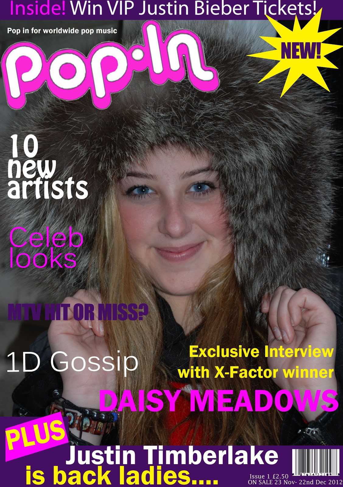
Daisy is fresh out of X-Factor and ready to bring the girl power!

1.      Daisy, who inspired you to enter the X-Factor?

My mum and dad! They have always supported m in my singing and wanted me to follow my dreams. One day my mum brought home a form to fill out to enter the show and it all just happened!

2.      Did you expect this amount of success?

No! I never even expected to get past the first round, let alone win! I really am very blessed and thank God each day for my fans and their support it really means a lot to me.

3.      Did you always want to be a singer/songwriter?

Like most children as a child I went through phases at first wanted to be a doctor but I hated blood! (Laughs) Then I went to theatre school at the age of 8 and realised my true passion and direction, performing.

4.      Who are your musical inspirations?

As a child I listened to Mariah Carey a lot, also my mum loved Elvis Presley who has really influenced my song writing career. However in terms of present artists, I LOVE Beyoncé, she just has so much attitude and talent, I’d kill to work with her one day.

5.      What was it like having Simon Cowell as your mentor back when you were on X-Factor?

Everyone thinks he’s really mean but in reality he is the best mentor I could have asked for! Yes, he is a task master but when you are in a completion like the X-Factor it is a very lengthy process and you need that push.

6.      Are you still in touch?

Yes, I saw him last week; he came to give me my birthday present.

7.      Oh Happy birthday! What did he get you?

A stunning Louis Vuitton handbag! I’m a very lucky girl!

8.      How was the X-Factor tour?

Gruelling but amazing! I had so much fun and get on sooo well with the rest of the guys; we are literally one big family (as cheesy as it sounds). Plus the response from the fans was incredible I couldn’t believe it; it was so overwhelming!

9.      Is it true you were a victim of bullying?

Yes, along with many other young teenagers today. From about the ages of 12-16 I was bullied mainly because I was different.  Was a little chubby in comparisons to the rest of the girls, the enjoyed shopping and I enjoyed singing. But I beat the bullies and I would advise anyone out there who is being bullied to be themselves it doesn’t matter what other people think, you can prove them wrong!

10.  When will your debut album My Journey be released and will there be a Tour?

The album should be released next year as I’m still in the process of writing most of the songs and a tour, wow I haven’t yet thought that far ahead however, I would love to tour in my opinion that is the best part of my job! Don’t worry if anything happens my fans will be the first to know! (giggles)

11.  Are the rumours that you went on a date with Harry Styles from One Direction true?

(Laughs) No, definitely not! Harry and I are very good friends, I love him like a brother! We have never been on a date and never will, he knows what the X-Factor Is like and is someone I can talk to, nothing more! (Smiles)

12.   Aww we were hoping for a new Posh and Becks! So what are your plans for the future?

I hope to release my first album next year and then possibly go on tour. In the long-term of course I want music domination (laughs) but I will be happy as long as I get to keep singing and writing songs whilst making my family, fans and all who voted for me proud.

13.   Do you have anything to say to your fans?

First and foremost I’d like to say THANK YOU! I couldn’t have come this far without you, your votes and support mean more to me then you will ever know and I feel very humbled! Also I’d like to tell you all to believe in yourself and your dreams no matter how big or small and never ever let anyone tell you that you can’t achieve those dreams because YOU CAN!

Daisy’s debut album ‘My Journey’ is available to download off I-Tunes from 20th March 2013


Some Photos from my Phtoshoot

I did a photo shoot on Oxford Street in London with my model Morgan McGinn and here are a few of the many photos that I took, each in different locations along the street experimenting with different mis-en-scenes, angles and eye lines.


Tuesday 26 February 2013

Magazine Layout Research

I wanted to prepare for the big job of creating a music magazine therefore I did some research into layouts and conventions and found this video . It was very useful as it helped me see how to create a stereotypical magazine which includes different elements to create an original layout that differs from all the other pop music magazine yet sticks to the typical and expected codes and conventions.

Saturday 23 February 2013

The Treatment


The Magazine: Pop-In

Target Readership
Pop-In is a new magazine that is aimed at female teenagers who enjoy pop music. The Pop-In reader is 12-17 readers old and their parents would fall into the C1/C2 socioeconomic grouping, therefore readers will rely on finance from their parents. Due to this Pop-In magazine will be relatively low in cost and as the readers will have grown up in the 21st century they will expect equality for all genders. They like mainstream music and enjoy a magazine that doesn't challenge them in any way but its sole purpose is comfort. They inspire to be like the celebrities featured in the articles and are up-to-date with the latest music, fashion, gadgets and hobbies. The average Pop-In reader is friends with everyone and tries hard at school yet enjoys spending time with her friends when she is not working; doing things like going to the cinema or shopping. They will have new gadgets like I-Pods and spend lots of time on I-Tunes or in music shops, they are confident yet think of others around them and enjoy both singing and playing different sports such as netball. They love reality TV especially when music is incorporated into the programme for example, X-Factor or Britain's Got Talent. They also love boy bands for example 1Direction and love discussing them with their friends. A Pop-In girl is social, lots of fun to be with and up for a laugh but also is kind to all and loves pop music

Form and Style
Pop-In is an A4 sized magazine containing everything you need to know about pop music. It will be released fortnightly and target young females from the ages of 12-16. Each issue will feature posters of celebrities and various interviews from them. Articles will mainly be on boy bands and other famous male artists such as Justin Bieber. The colour scheme will be bright and bold reflecting our reader, with primarily purple and pinkish colours. Cover lines will be contemporary and deal with everyday issues and topics that interest teenage girls. Not only will the magazine included celebrities but there will also be interesting competitions and reviews of the latest pop songs. they layout of the front cover will be bright and clustered to show value for money and will always feature a celebrity on the font as I know that from my research this is what pulls teenagers in. Finally the price will be £2.50 as it is affordable enough for teenagers to spend their pocket money on yet expensive enough to make a profit.

Themes and Typical Features
Inside Pop-In there will be made regular features such as the competitions, the review page and the final article, '10 minutes with...' (with a different celebrity each week). These regular articles will give the reader a sense of familiarity coaxing them back for more, mixed in with different articles depending on what has happened over the past 2 weeks, such as and article on The Brits. Although celebrities will play an integral role in the magazine, especially male ones, we still aim to unite girls through pop music and help them in any way we can, therefore another regular page is agony aunt in which young girls can vent their problem and we can hopefully help them. It is not all about celebrities we also aim to promote new, up an coming artists keeping our readers 1 step ahead of the game so that they can impress their friends with their extensive knowledge of modern pop music through our reviews and recommendations. We hope to write informative and inspiring pieces with modern language and about topics that the young can relate to and enjoy.

Potential Advertisers
We want there to be a ranger of adverts throughout our magazine every 2 weeks, advertising popular goods directed at teenage girls for example; Top Shop, Hollister, Forever 21, Miss Selfridge, Herbal Essences, Barry M, HMV, Loreal, Millie's Cookie's etc.

Editorial Team
The editorial team for Pop-In will be made up of young (in their 20's) writers and editors who have a passion for pop music and writing. They will have probably grown up in a generation of 'Top of the Pops magazine' and know what we are aiming for, plus have some knowledge of the present young generation.

Research into Photography

I have never taken a professional photo before therefore before my test shoot I did some research on taking photographs and one of the most helpful websites was here.
Although not all the information is relevant for a front cover the site really helped me consider simple thing such as lighting, angles etc and I hope this new knowledge will be useful when I take my photos for my music magazine.

As my photography will be relatively basic I have found this slide show to help me. This has aided me to consider how I will take my shots and especially how I will compose my shot in terms of perspective and technically in terms of exposure and brightness etc.


A photographer that I have come across in my research that really interests me is Herb Ritts (see left), a famous portrait photographer for many famous celebrities and top brands such as Vanity Fair and Calvin Klein. Throughout his career he liked simplistic photos that emphasized lines, form and shape. His photographs have inspired me in taking my front cover shot and persuaded me to have a more simplistic yet eye catching type of shot. He especially liked black and white however as my magazine is aimed at a young audience and the genre is pop I think it would be best if I had a bright eye catching colour scheme instead.

Friday 22 February 2013

Photoshoot plan

For my music magazine I plan to photograph my friend, Morgan McGinn in London.
 
The factors that I'll be considering when taking my photos will be:
  1. wardrobe i.e. costumes, hairstyles, make up, jewellery
  2. location
  3. props
  4. lighting
  5. camera angles
Wardrobe
As my magazine focuses in on pop and chart music, i must have my model in something modern and trendy; she is a role model and therefore girls look up to her style. Additionally her hairstyle, jewellery and make up must to reflect this. She must also look natural and fresh faced as she is a relatively young girl who has only just risen to fame. For example like the photo to the right of young singer/songwriter Taylor Swift. I want my model to look like an ordinary girl,  a girl that readers can relate to but with that confident spark that others admire, she should stand out from the busy location. I would like her hair to be down and quite wind swept as if she is lost in the busy London crowd yet stand out and be different from the masses of people.

Location
The location I have chosen is London. I have chosen this area as it is very busy and I think it reflects the models new life as a winner of the X-Factor, additionally I believe that the shots should show her standing out of the crowd highlighting how she was picked out of millions of people in the competition. Plus in the city of London there is lots of vibrant colour to catch the eye of the reader. This  location is also fitting as I am aiming for this magazine to be the most popular in the UK so London is an area which people know and can relate to.

Props
I want to use props that people use in everyday life to allow readers to relate to the model. I have not yet finalised my decision on props but I have considered these options:
  1. I-Pod
  2. newspaper/magazine
  3. book
  4. some confectionery

Lighting
As my location is outdoors I unfortunately rely very heavily on natural lighting. This will make things more difficult as I cannot control the amount of lighting in one particular shot but I will try my best and possibly alter the photos on programmes such as photo shop later on in the process.

Camera Angles
For my shot for the front cover I would like it to be relatively serious with a low angle mid shot showing in full light my model and her clothing. her stance should be confident with a direct address to emphasise this. Additionally I would like two less serious photos for the double page spread, one long shot and one mid shot possibly with different eye lines and I would like my model to be laughing in one of them to show she is a normal girl and to relate to the readers.

Thursday 21 February 2013

Textual Analysis - Contents Page for Music Magazines

1) Top of the Pops
This magazine is a stereotypical and successful pop magazine therefore as expected the colour scheme is a mix of pink and purple with yellow highlighting interesting articles to hook the reader in. The colours connote fun and happiness plus this house style is very girly and appropriate for this type of magazine. However, it is not just the unique selling points and house style that sells the magazine but it also the images, for example the image of popular boy band, One Direction is certain to attract readers. Bleeds have been used for the photo of one direction giving the page a more informal and cluttered look to appeal visually to the young readers. Plus the mode of address is very cheesy and typical to girls magazines by using informal colloquial language such as "We heart shopping". Additionally, important page numbers stand out in bright pink around the front cover for easy navigation throughout the magazine and this helps younger readers to find pages quickly and efficiently. The contents page does follow the normal convention of rule of thirds by splitting the magazine into three and there is also a page number at the bottom of the page for future reference.


 2) NME
This contents page is very different from the previous one however it does follow the conventions of a usual contents page but in its own way, such as the 2 to 3 column layout is there but the columns are irregular and boxed instead making the page more visually interesting and different from the average contents page. The main articles have been placed in boxes with large red numbers that stand out (for accurate navigation) and pictures are also included in the boxes enticing the reader into buying this magazine. In the bottom right hand corner there is an advertisement, telling the reader about the advantages of subscribing to this magazine; it is in bright red to catch the readers and eye and ties in with the NME logo. The magazine targets an alternative audience, it does not promote mainstream pop songs unlike the contents page above therefore the colour scheme is relatively dark but with an all round different style. However, there are still small pictures of popular artists next to page numbers to lure readers in. Another interesting thing is that both magazines have attempted to make their contents page different from the norm by calling it something different for instance, inside this week.

Textual Analysis - Double Page Spread for Music Magazine

 
1) We Love Pop
The main colour scheme for this popular pop music magazine is pink and black which ties in with the celebrities clothing. The hook is the title which is the largest font to pull in readers; additionally key points are highlighted in yellow to encourage readers to read on. The lighting is bright and you can clearly see the celebrity endorsement, plus her name is in a bubble on the right hand side of the second page. The photograph is a long shot as it takes up half of the double page spread and is at a slightly low angle to the show confidence of the celebrity. The long shot also allows you to view the trendy clothing that the artist is wearing and also her stance. The celebrity's stance shows dominance and her clothing not only tie in with the colour scheme but they are also very modern; appealing to the young generation. The celebrity's name itself is a unique selling point as I mentioned above, it has been emphasised in the right top hand corner to catch the attention of anyone who is flicking through the magazine. On the right hand page the text is organised into three columns typical of articles with a small picture of the celebrity to draw in the attention of the reader. Finally at the bottom of the page there is a page number for future reference.


2) NME
This double page spread is quite different from the one above however, it still has the same codes and conventions as most double page spreads in magazines. The left hand side is dedicated completely to one long group shot of the band, it is a colloquial and laid back mis-en-scene. We see this through the lighting and location as it seems to be natural lighting in a n everyday living room or games room. Clothing is also casual plus the eye lines combined with their facial expressions (smiling and laughter) of the group connote that it is a laid back environment.  The Title of the interview is a pun as the group is called The Cribs and is the largest font on the page catching the eye of the reader and encouraging them to read the article. The colour scheme is continued on the double page spread as it is the same on the front page creating a sense of familiarity and links the article to the cover. Also the pull quote is put in bigger font and in speech marks to interest the reader. On the left hand page the article is split into three columns like the spread above however, NME have changed the positioning slightly to make the article more eye catching and also included a small picture in a central position to entice the reader to read the article. Finally at the bottom of the page there is a page number to refer back to if needed.

Textual Analysis - Front Cover for Music Magazines


 1) NME
NME or New Musical Express is a well known, successful music magazine that has been running for over 60 years. They usually interview new up and coming artist and this issue is no exception. They have interviewed The Cribs who are a young, punk, alternative group and the mise-en-scene reflects this. The colour scheme is relatively dark to emphasize this and to allow the masthead and the hooks in white and yellow to stand out. In addition to this, the lighting is low and the band's mode of address is  casual, as they a sitting/crouching in a casual position possibly to relate to the reader and portray that they are the same as everyone else. The costume is also quite normal and down to earth with an alternative vibe to further emphasise their casual stance. Direct address is used to appeal to the reader and the shot is obviously a group shot to fit all three members of the band into the frame. The selling points are unique and stand you with a line of The Cribs' interview to entice the reader into buying the issue. There is also a free CD, which is a persuasive factor to further entice the potential reader. Finally like most magazines there is a barcode for purchase reasons plus the date, price and issue number for future reference; however unlike most magazines there is no strapline.


 2) Uncut                                                                               
Uncut is a less well known magazine that was first published in 1997 and is a magazine that not only focuses on music but film and books too. The mast head is the same on each issue and the brightness pulls in readers whilst giving a sense of familiarity.  It also ties in with the white, red and black colour scheme used for the front cover of this particular issue. Unique selling points stand out in these bold colours and various types of font with the celebrities name in the biggest font to catch the eye of potential readers. 'Free CD' is also in a big badge, once again to entice the public to buy the magazine. The mise-en-scene is quite old as the cover shot is a medium shot taken in black and white giving an olden time feel to it, which is fitting as they describe Tom Waits as a 'legend'.  The model is also wearing old vintage-type clothing yet with a modern scruffy twist to appeal to the readers in their early 20's. The stance of Tom Waits is quite laid back and is taken at a low angle with direct address to portray his confidence. Lastly there is also a barcode, price, date and issue number for future reference.                                  

3) We love pop
The bright colours of orange and blue allow this magazine to stand out on the shelf, along with the different and exciting masthead that combines both picture and word appealing to the younger generation. The symbol of the heart is quite like text speak creating a familiar air for the readers. Additionally the lighting is bright so onlookers can clearly see the celebrity endorsing the magazine and also her clothes which are preppy and modern. Her stance is also informal and relaxed with direct address is used in a medium shot to appeal to the reader and display her clothing. The audience have clearly identified what their target market enjoys as they have included many articles on boys including a picture and also fashion, plus the various fonts are easy on the eye and important articles are highlighted to draw the reader in. The lure under the celebrities picture also draws in the audience and the celebrities name is in bright colours and the biggest font on the page to attract more readers who enjoy pop music. The mise-en-scene overall is preppy modern and young with an exciting young vibe appealing to the teenage audience. Finally, like most magazines there is a barcode, price and issue number for referencing to.