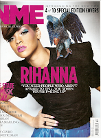
My task is to create a student magazine for 16- 18 year old. Therefore the magazine has to be young, contemporary and deal with issues of the youth today. I am targeting this magazine at both genders to have a broader audience however my front cover will be a young female student.
Typical Conventions of a Student Magazine are:
- Bright colour scheme
- Unique selling points that would interest young people
- A young, confident looking model in modern stylish school-like clothing
- Bold eye catching masthead
- A short strap line
This is my first attempt to create a student magazine on photo shop. I am happy with my colour scheme as I think it works and allows the magazine to stand out. However some font is not very visible. Additionally I don't like the shadow behind the photo, therefore I will have to take lighting into consideration for my music magazine. Finally I would prefer possibly a lighter background that is easier on the eye than plain grey. In my opinion I think what the model is wearing is fitting with the young yet business like vibe and the slight low angle shot gives off a care-free confident feeling from the model.
I think that my magazine is quite conventional to student magazines as it is colourful with unique selling points directed towards the young and a picture of a teenager. It includes everything you would expect to see on a front cover such as a bar code, date, price etc. yet the colours of the cover are bright and the green stands out as you never really see green much on the front of magazines. As it is clearly aimed at the youth I have adapted the articles to suit my target audience and used bright colours to catch their eye.
To create my front cover I used Photoshop as the cover is taken up by a photo, therefore I thought that this would be the best option for me. However, it was more challenging than I thought as I had never used Photoshop before, saying this I did manage to work my way through discovering useful tools like the magic wand and the lasso tool and I aim to do some practice before creating my music magazine in the future.

Additionally my contents page has stuck to the typical codes and conventions of a student magazine. The colour scheme ties in with the front cover for a sense of familiarity, plus the colour is unisex and will appeal to all giving a broader target audience. I also included the rule of three and an editors letter. I made sure all the articles were student orientated and even cross referenced the front cover for easy and accurate navigation.
For the contents page I used publisher as Photoshop was not very useful when the product is not photo orientated, I did not find this too challenging as I have had some experience of publisher before however I learnt more skills whilst constructing this page including changing the tone of your background and how to create an effective colour scheme.
I think that my magazine is quite conventional to student magazines as it is colourful with unique selling points directed towards the young and a picture of a teenager. It includes everything you would expect to see on a front cover such as a bar code, date, price etc. yet the colours of the cover are bright and the green stands out as you never really see green much on the front of magazines. As it is clearly aimed at the youth I have adapted the articles to suit my target audience and used bright colours to catch their eye.
To create my front cover I used Photoshop as the cover is taken up by a photo, therefore I thought that this would be the best option for me. However, it was more challenging than I thought as I had never used Photoshop before, saying this I did manage to work my way through discovering useful tools like the magic wand and the lasso tool and I aim to do some practice before creating my music magazine in the future.

Additionally my contents page has stuck to the typical codes and conventions of a student magazine. The colour scheme ties in with the front cover for a sense of familiarity, plus the colour is unisex and will appeal to all giving a broader target audience. I also included the rule of three and an editors letter. I made sure all the articles were student orientated and even cross referenced the front cover for easy and accurate navigation.
For the contents page I used publisher as Photoshop was not very useful when the product is not photo orientated, I did not find this too challenging as I have had some experience of publisher before however I learnt more skills whilst constructing this page including changing the tone of your background and how to create an effective colour scheme.


